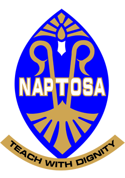
 We know the NAPTOSA logo, but do we know what it symbolises?
When the NAPTOSA Federation amalgamated with six other unions on 1 November 2006, it was decided that the essence of the Federation’s logo would be retained, as it was already well known within the education sector and the teaching profession and would continue to contribute to the future branding of the amalgamated NAPTOSA Union. However, certain elements have been changed or been added to reflect what the new amalgamated union stands for.
The motto “Teach with dignity” was retained, together with the NAPTOSA colours : blue symbolising industriousness and gold, dignity.
The shield which forms the basis of the logo was adapted in order to reflect an African influence.
A new element which was added is the seven convergent panels at the base of the logo. These panels represent the six independent unions and the NAPTOSA Federation that amalgamated to form a single union.
The two shepherd’s crooks have been retained from the old logo and symbolise the fact that teachers walk in front, leading the learners.
The burning candle at the crest of the logo indicates enlightenment – the primary task of the educator.
This is indeed a logo of which every NAPTOSA member can be truly proud.

